You can download the data as well as the python script HERE. For those that have yet to migrate to ArcGIS PRO, I have included a file database containing the data as well.
The concept of the ”fishbone analysis” was described to me a while back. I had never really heard of it and had no idea how it could apply to my work. I did a quick search later that night for terms like “fishbone analysis” and “fishbone analysis GIS addresses” and pretty much nothing relevant came up. After some more research I realized how awesome this could be and I wrote this so you don’t have to go googling – let me explain:
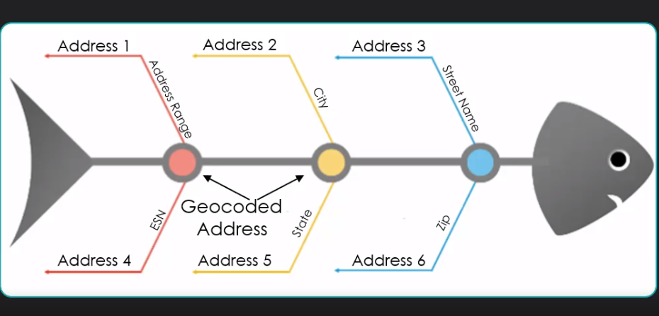
A fishbone analysis is a structured process which can be useful for determining the underlying causes behind certain problems by visually evaluating cause and effect. In terms of GIS and attribution, this analysis will allow you to visualize attribution errors between road centerlines and address points. this is done by comparing the original address location to the geocoded address location’s position along a street centerline.
I finally understood the basic idea: Addresses and Streets with good attributes should produce good looking line-work at equally spaced intervals from where the original address is located to where the geocoded address lands along the road centerline. In the screenshot below, you can see the basic premise of how high-quality address data looks. Some of the attribution errors that can be visualized are:
- Addresses or road address ranges out of numerical order
- Addresses or road address ranges on the wrong side of the street
- Addresses or road address ranges on the wrong block
- Attribution errors with street pre-directional, post-directional, and street name
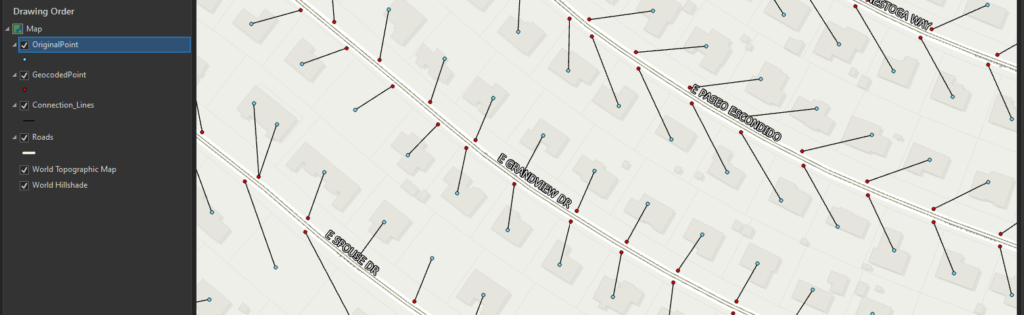
The interesting thing about the fishbone analysis is that it lets you visualize see the attribute errors in your data. The simple premise is that these fishbone lines should never (okay, almost never) cross. When the lines cross, it is almost always indicative of attribution errors in either the road centerline attributes or in the address attributes.
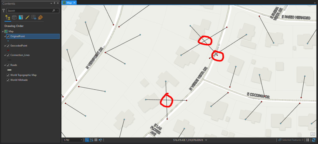
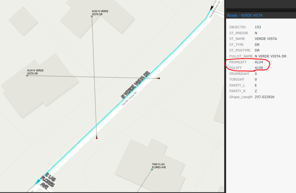
When we zoom closer we can see that these addresses on the right side of the centerline have geocoded to the left side of the centerline. When we look at the attributes, we can see the “FROMLEFT” and “TOLEFT” address ranges have values corresponding to addresses on the right side of the street. These values are circled in red. You will also notice the values for the “PARITY” fields are incorrect.
To create the fishbone analysis, the original address points need to be run through a dual-range U.S. Address Geocoder. I will not go into detail regarding how to create those as there is good documentation out there. Instead, I will focus on the logic behind building the lines. This next section assumes you have created an empty polyline feature class to hold the new line geometry. You can create one with the tools provided by ESRI and you can use the geocoded address feature class as a template if you want
Step 1: Create List to hold new lines
Step 2: Use Search cursor to retrieve information

Step 3: Iterate through each row and assign values to new variables
Step 4: Use an Insert Cursor to insert new records into polyline feature class
The script is provided below for those who do not like downloading zip files from the internet. Feel free to test it with your own data.
"""
-------------------------------------------------------------------------------
Name: Fishbone Connection Lines
Purpose: This script is intended to be used as an example for building line
geometry to create a fishbone analysis
Author: John Ehlen
Created: 06/01/2020
This script assumes other steps not needing python have been completed. The
intention is to take a set of original address points and a set of geocoded
address points and build line geometry between them. There are many ways to
achieve this, including using SHAPE@ tokens, however I chose to use attributes
in the original address feature class that propogated through the geocoding process.
Further analysis can also be achieved depending on data quality and needs. It is possible
to autmate the entire process from Dual Range U.S. Address locator creation to
the creation of relationship classes between the geocoded address
points, the connection lines, the original address points, and the road centerlines.
For help with any of these topics reach out to me at John@johnehlen.com
-------------------------------------------------------------------------------
"""
# Truncate old connection lines feature class records
arcpy.management.TruncateTable('Connection_Lines')
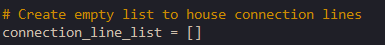
# Create empty list to house connection lines
connection_line_list = []
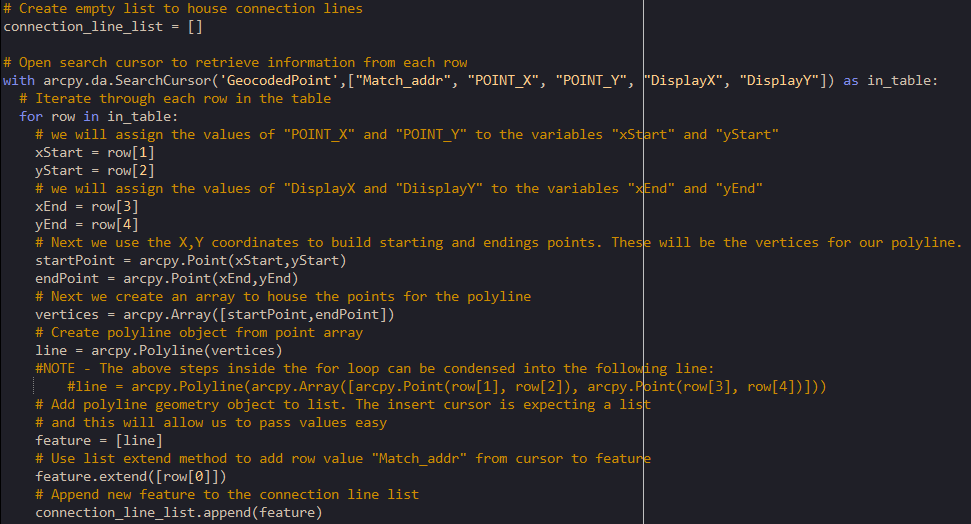
# Open search cursor to retrieve information from each row
with arcpy.da.SearchCursor('GeocodedPoint',["Match_addr", "POINT_X", "POINT_Y", "DisplayX", "DisplayY"]) as in_table:
# Iterate through each row in the table
for row in in_table:
# we will assign the values of "POINT_X" and "POINT_Y" to the variables "xStart" and "yStart"
xStart = row[1]
yStart = row[2]
# we will assign the values of "DisplayX and "DiisplayY" to the variables "xEnd" and "yEnd"
xEnd = row[3]
yEnd = row[4]
# Next we use the X,Y coordinates to build starting and endings points. These will be the vertices for our polyline.
startPoint = arcpy.Point(xStart,yStart)
endPoint = arcpy.Point(xEnd,yEnd)
# Next we create an array to house the points for the polyline
vertices = arcpy.Array([startPoint,endPoint])
# Create polyline object from point array
line = arcpy.Polyline(vertices)
#NOTE - The above steps inside the for loop can be condensed into the following line:
#line = arcpy.Polyline(arcpy.Array([arcpy.Point(row[1], row[2]), arcpy.Point(row[3], row[4])]))
# Add polyline geometry object to list. The insert cursor is expecting a list
# and this will allow us to pass values easy
feature = [line]
# Use list extend method to add row value "Match_addr" from cursor to feature
feature.extend([row[0]])
# Append new feature to the connection line list
connection_line_list.append(feature)
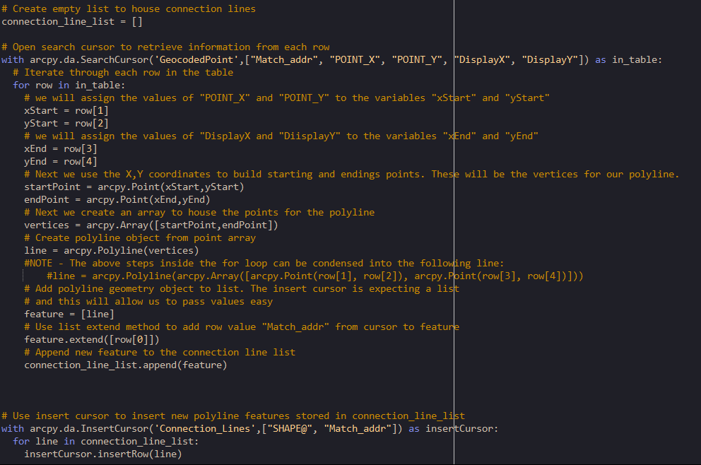
# Use insert cursor to insert new polyline features stored in connection_line_list
with arcpy.da.InsertCursor('Connection_Lines',["SHAPE@", "Match_addr"]) as insertCursor:
for line in connection_line_list:
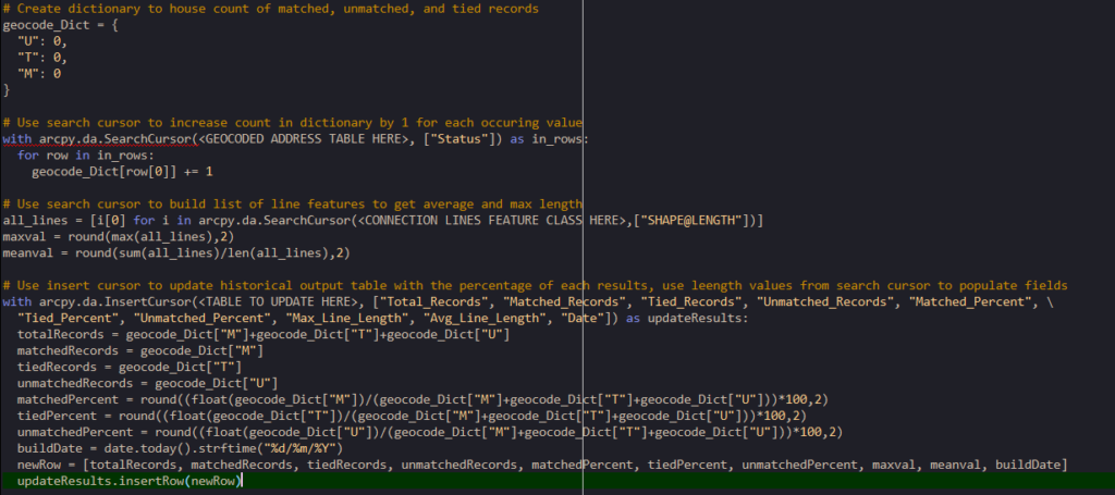
insertCursor.insertRow(line)#NOTE: The above script is as basic as can be to accomplish this task. In the script I use at work, I rebuild the address locators, create table views to manipulate attributes, and rebuild relationship classes in the database. The script I use at work also updates a table in the database recording the total amount of geocoded addresses, the percentage of matched/tied/unmatched addresses, the average length of the connection lines, and the longest connection line. By charting these values over time, we can visually graph the progress of the data cleanup. I have included an example of the table update below:
I hope you found this useful and interesting. If you have any questions regarding a process and need help accomplishing this, or just want to reach out to me about something else, leave a comment below or email me at John@johnehlen.com
This seema like a problem that could also be solved with graph theory.
https://www.sciencedirect.com/science/article/pii/S0198971516303970?via%3Dihub
Daniel, Glad to see you’re still alive and well!
You are absolutely right, this could be solved in many different way, including graph theory. However this is meant for people with limited programming experience and just a basic understanding of point and line geometries. As many municipalities prepare for NG911 in the coming years, they face stringent requirements on data that no one has been maintaining. This fishbone analysis serves as a starting point for performing some basic, but important, attribute cleanup before focusing on the more complex tasks.
Major thankies for the article. Really thank you! Keep writing.
Keep all the articles coming. I love reading your posts. All the best.
Howdy just wanted to give you a quick heads up. The words in your post seem to be running off the screen in Chrome.
Pretty! This was an incredibly wonderful post. Thanks for supplying this info.